Color Tricks, Tips and Recipes
One of the bewildering things for someone just starting out in almost any artistic endeavor is that colors don't mix in the same way that popular wisdom would have you think.
An excellent book for teaching about color theory is called "Blue and Yellow Don't Make Green," by Michael Wilcox. Another by the same author is "The Artist's Guide to Selecting Colors."
We aren't going to go into that depth, here, at least, not for now. I will say that there is a dazzling array of luscious colors available in all the
brands of polymer clays and tell you that even though it would be great to have them all handy, it really isn't necessary. You can learn to
mix any color you choose with a smallish selection of pure colors, and will be adding to your capability and skills as well as saving your
checkbook.
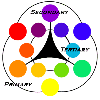
We're going to take a look at a basic color wheel, and I'll suggest a starting
"shopping list." It's not that big a list, which you might guess if you've
already read my suggested beginner's tool shopping
list.
Warm<--->Cool
Violet

Blue

Green

|
|
Warm<--->Cool
Red

Orange

Yellow

|
Looking at the color wheel, you can see that every primary color is opposite a "secondary" color, a color that is mixed from two primary
colors. Any color's opposite serves as it's complement - an accent color within a piece, such as small bunches of turquoise forget-
me-nots in a bouquet of peach roses. Within a clay mixture, a color's complement is also it's "dimmer." If a red is too dark, for instance, you
can "dim" it's chroma by adding a touch of green. Adding a color's complement creates a clearer color than the "dead" mixes
that can result from adding black to darken a color. Mixing nearly equal parts of a color and it's complement will usually create
brown tones.
When you've dimmed a color to the brightness that you want, you can then add white to create different "tints" of that color, more amounts of
the complement to create "shades" of that color..... they will all work together in a piece. A monochrome piece would be one that uses only
these tints and shades of the same color.
Make a complementary scheme by using tints and shades from two complements. Usually one group of colors will be dominant in any piece,
the complement acting as an accent.
More complicated color triangles would involve selecting one color and adding the two colors that flank it's complement, such as having violet
as the main color with touches of yellow-green and yellow-orange for accent. (Mardi Gras = purple, green and gold) Or one color plus it's complement plus the two that flank either the dominant or the accent color, such as blue with aqua and blue-violet, with
shades of orange as accent.
Please understand that these are beginning guidelines, and there is at least one way to break any "rule" you can think of, and still get excellent results.
Color theory is so complicated that volumes have been written about it, so I'm not going to attempt to cover much of it here, but one other important
point is that colors have a perceived "temperature," warm or cool. We think of the reds, oranges and yellows as being warm colors, and the
blues, violets and greens as being cool. However if you look again, you will see that some reds are on the "cool" side (burgundy, for instance,)
while some greens fit nicely in the "warm" range. The reason that this is important is that if you're trying to mix a warm blue with a cool yellow,
you will get very different results than you would from mixing cool with cool. Of course many other factors have effect on your results, such as
opacity, room lighting, etc. Having a feel for a color's "temperature" just gives you one more idea to work with.